Monthly factsheets are one of the most unforgiving recurring deliverables in asset management. Same five pages, same charts, same tables, same layout: only the numbers and the commentary change. The work is almost entirely mechanical, and yet every month it eats an afternoon of copy-pasting from Excel, tweaking chart sources, repositioning stubborn shapes, and writing a commentary that sounds broadly like last month's with fresher figures.
This post walks through how to automate that entire production cycle in Octigen, starting from an existing PowerPoint template. We will build everything a fictional asset manager, Meridian Grove, needs to produce its monthly fund factsheet: the data plumbing, a reusable workflow, and an AI-assisted commentary. By the end, generating next month's factsheet is a matter of uploading the latest Excel files and clicking one button.
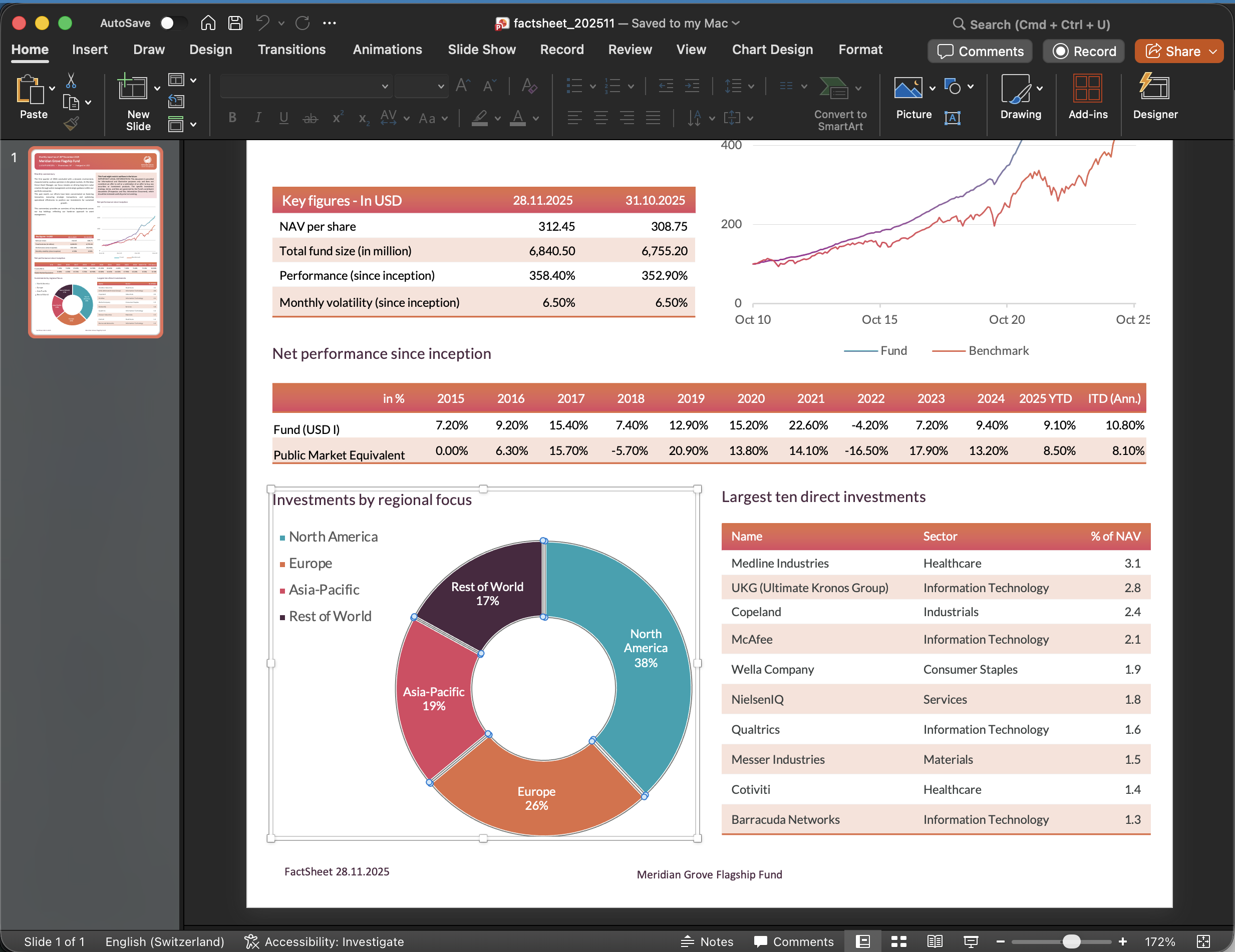
The starting point: a PowerPoint template
Everything begins with a .pptx file. Meridian Grove's design team has already prepared an A4 template with placeholders for three tables and two charts, the shapes that need to be refreshed every month with new data.
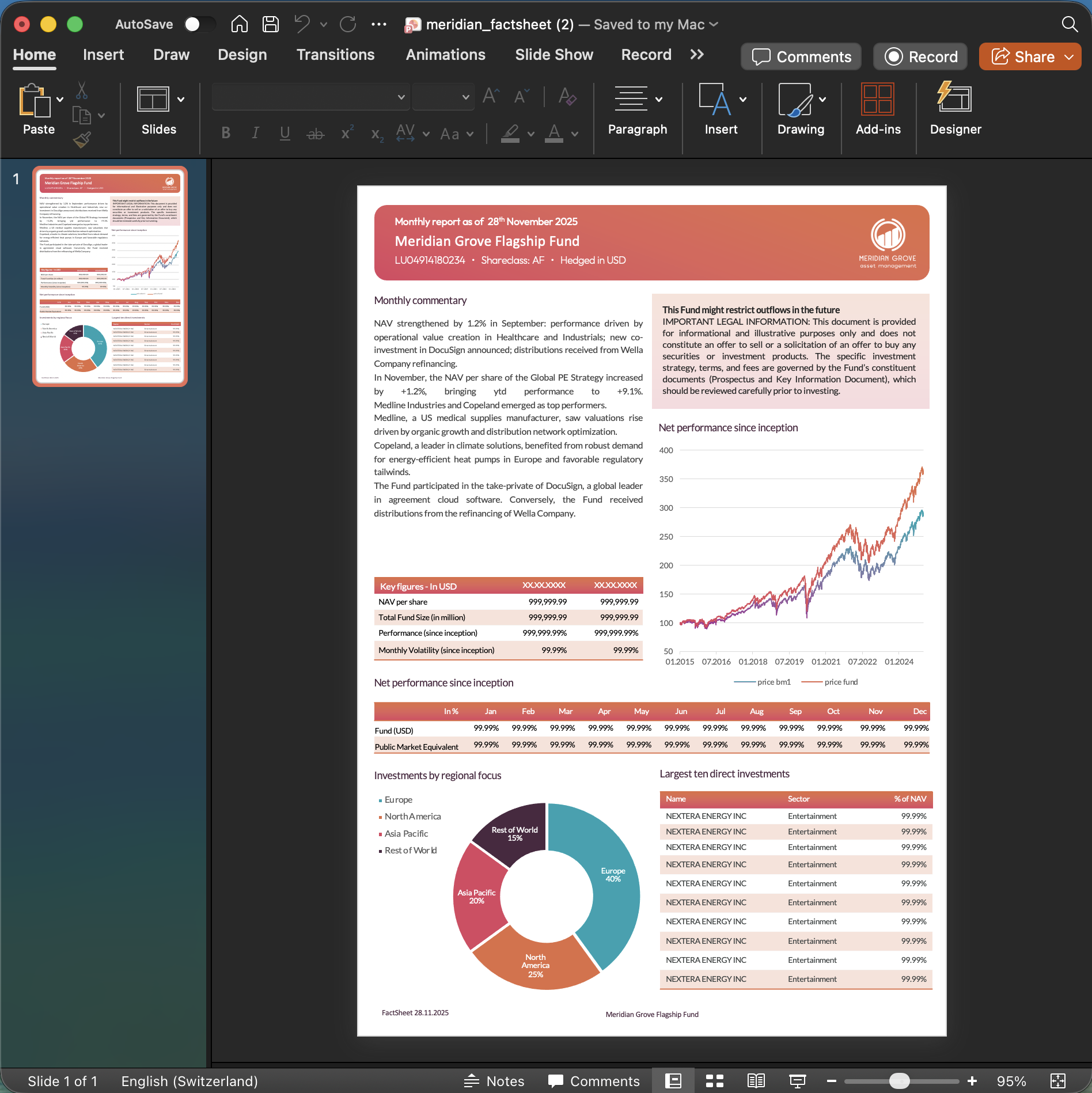
The template is the structural contract for every factsheet Octigen will produce from it. Brand elements, legal disclaimers, headers, and shape positions are fixed. The AI is never allowed to move a logo or invent a new layout; it can only populate the placeholders the template already defines.
Step 1. Data Collections: one folder per data source
Before we can wire charts and tables to their data, we need somewhere to keep that data. In Octigen, a Data Collection is a smart folder that holds versioned copies of the same dataset. Think of it as a typed directory: it knows what filenames to expect, what parameters to extract from them, and how to pick the right version at generation time.
For this factsheet, Meridian Grove needs five collections, one per chart or table:
- Fund Prices Monthly
- Returns Monthly
- Key Figures
- Allocations by Region
- Top 10 Holdings
Creating one is simple: pick a name, choose the source format (CSV or Excel), and declare the parameters that will distinguish one version of the data from another. For anything monthly and financial, the natural parameter is valuation_date.
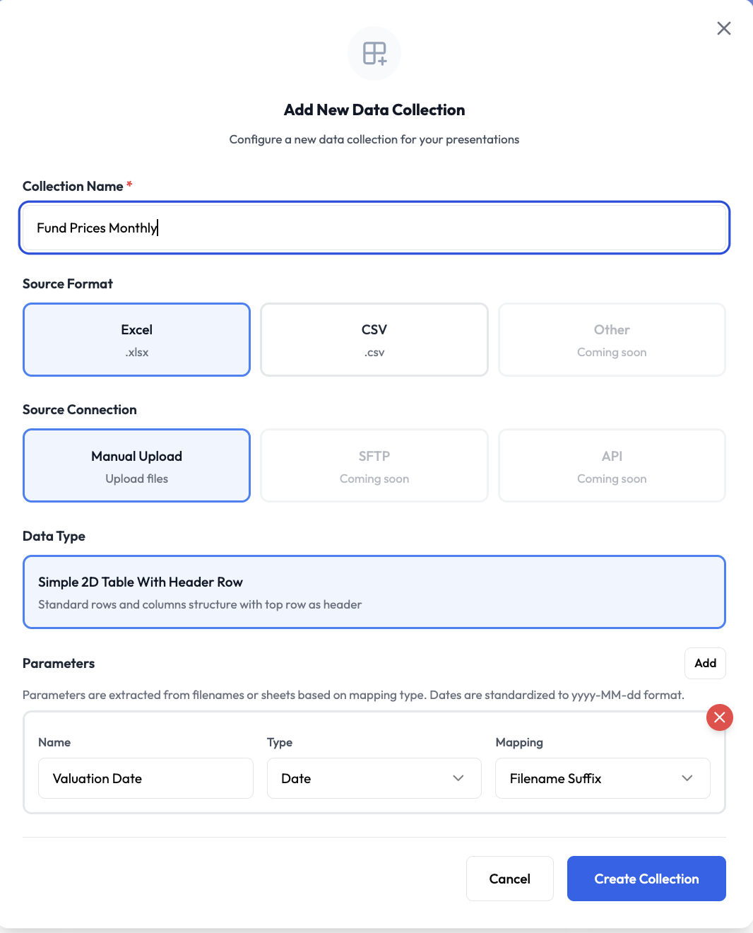
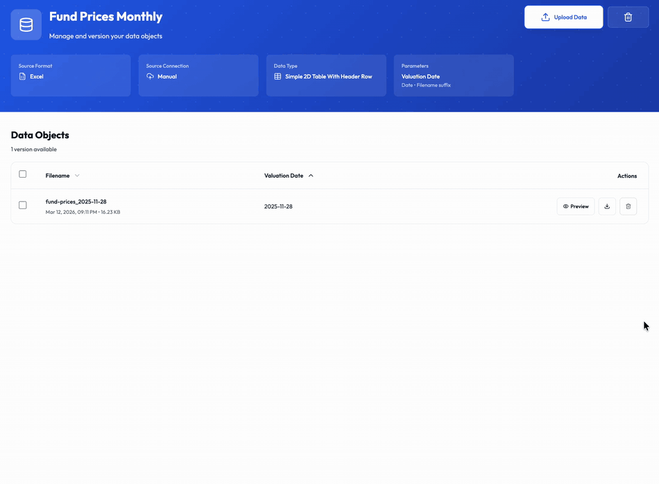
valuation_date, encoded as a suffix in the filename.Once the collection is defined, we drop the first Excel file into it. Octigen parses the filename, extracts the parameter value, validates the structure, and the data object is ready to be referenced by any chart or table we will wire later.
Because the parameter lives in the filename, there is no hidden state. Handing over the factsheet production to a new colleague is as simple as telling them: drop the monthly files into these five folders, using the same naming convention.
We repeat the same process for the remaining four collections. Five minutes of one-off setup, and the data plumbing is in place for every future factsheet.
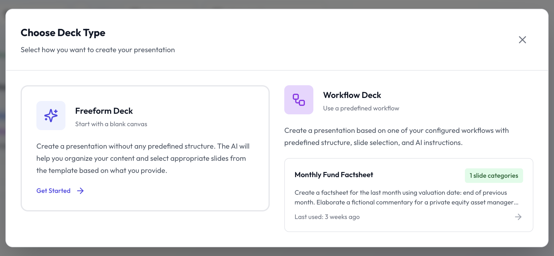
Step 2. The Workflow: a reusable recipe for the deck
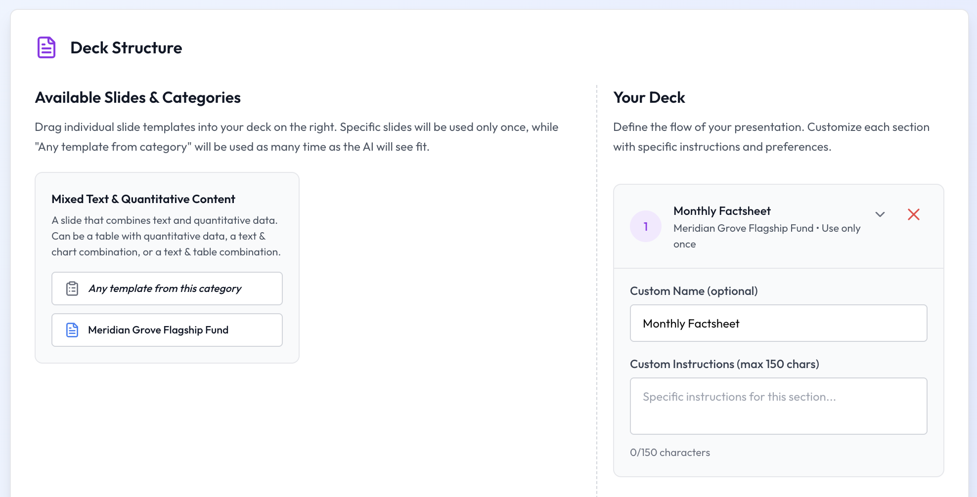
A factsheet is a deliverable that looks the same every month: same number of pages, same slide order, same tone of voice, same data wired to the same charts. That is exactly what Octigen's Workflows are designed to capture. A workflow is a named, reusable recipe that bundles the deck's structure, its tone and style, the instructions given to the AI, and (crucially) the connections between data collections and template shapes.
We create a new workflow called Monthly Fund Factsheet. Three decisions matter most.
Deck structure
The factsheet is a one-pager. The workflow's deck structure therefore has a single section locked to the one slide in our template: Monthly Factsheet.
Data connections
This is where the workflow pays for itself. On the left, our nine data collections. On the right, the five quantitative shapes from the factsheet slide: two charts and three tables, each with a machine-readable name. We draw a line between each shape and the collection that should feed it.
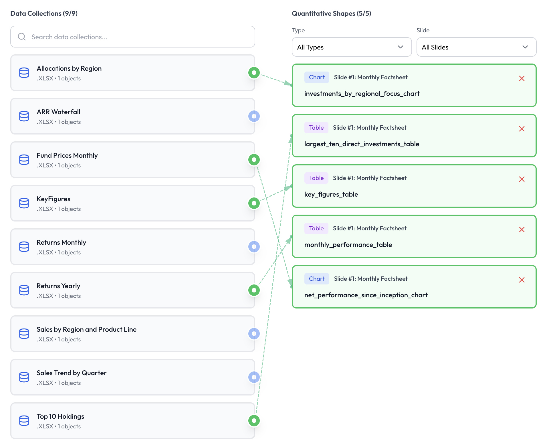
From this point on, nobody needs to remember which Excel file belongs to which chart. The workflow knows, and the wiring travels with it.
Tone, style and AI instructions
The rest of the workflow captures the softer constraints: a professional tone, a data-driven style, and a plain-English prompt explaining what the AI should write in the monthly commentary, including the instruction to read our top holdings from the data and do light online research around them.
Step 3. Running the workflow
With the setup done, producing a fresh factsheet is a matter of starting a new deck and picking the workflow.
Because each data collection uses valuation_date as a parameter, Octigen prompts us to choose which version of the data we want. We have just uploaded November's files (valuation date 2025-11-28), so we pick that across the board. One click per collection.
Every collection resolves, the data is validated upfront, and we move to the content phase.
Step 4. The AI writes the commentary
The numbers in a factsheet come from data; the story around them comes from the portfolio manager. Octigen's Content Assistant sits in the middle: given the workflow's prompt (written once, re-used every month) and access to the connected data, it drafts a commentary that references the fund's actual holdings and the month's actual performance.
The prompt we defined earlier asks the AI to read our top positions and do a quick round of online research around them. The draft comes back with context on the biggest holdings, wrapped in the professional tone we configured at the workflow level.
If the draft is close, we nudge it. If it is right, we approve it and move on. What we are not doing is typing the same 2,000-character brief into a generic assistant for the seventh month in a row.
Step 5. Preview, generate, done
Before generating the file, Octigen shows a live preview of the deck with the AI-written commentary, the resolved data, and the template's original shapes untouched. Once we are happy, we click Generate.
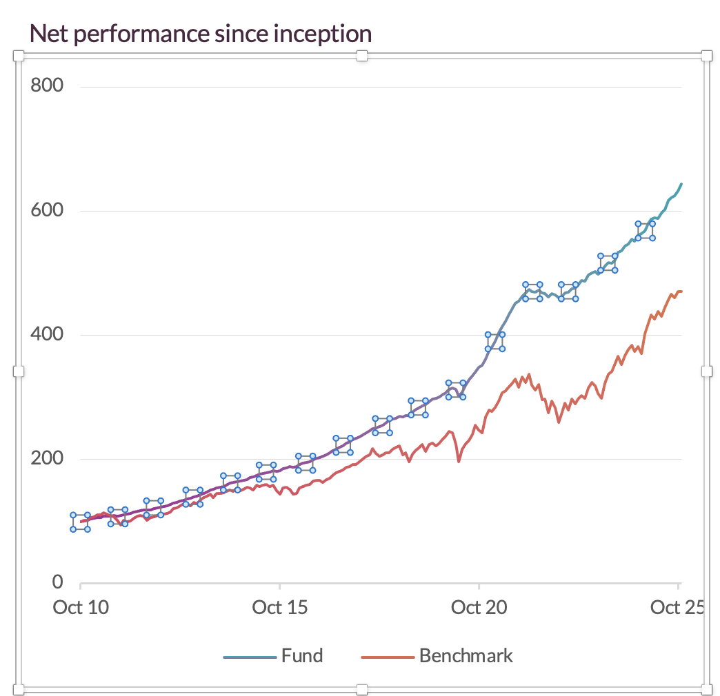
The finished .pptx lands in our Downloads folder. Opening it in PowerPoint shows the familiar template, with the same layout, same colours, and same disclaimer, and November's numbers where the placeholders used to be.
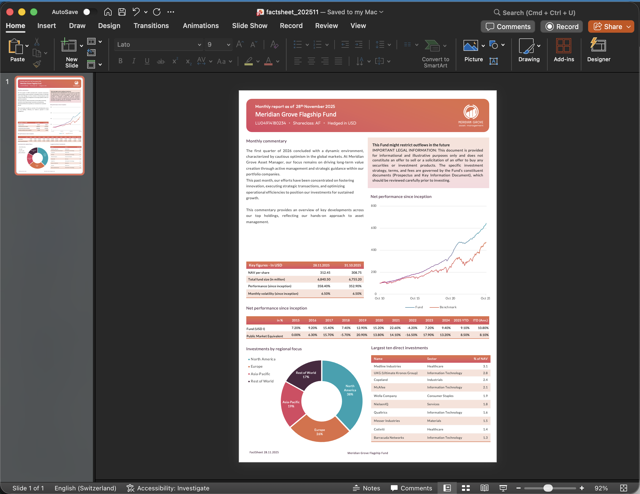
Why this matters: they are real PowerPoint shapes
A detail that is easy to miss: every chart and every table in the output is a native PowerPoint object. Not an image. Not a screenshot of a chart. Not a vector flattened on export. A real chart and a real table, with the data sitting inside the file, editable with a double-click.
And because PowerPoint recognises each shape for what it is, the ribbon adapts the moment you select one:

That matters for two reasons. First, nothing in the deck is locked to Octigen; if we want to tweak a label, adjust a colour, or add an annotation before sending it to investors, we do it in PowerPoint as we always have. Second, the file opens, prints, and behaves exactly like any other deck your compliance and design teams have reviewed a hundred times.
What the workflow is worth, in minutes
The first run (designing the template, creating the five data collections, wiring the workflow) takes about an hour end-to-end. Every subsequent month, the production cycle collapses to three steps:
- Drop the month's Excel files into the five data collections.
- Open the Monthly Fund Factsheet workflow, select the valuation date, review the AI commentary.
- Click Generate, download the
.pptx.
No copying values between files. No chart data source to rebind. No stray text box to drag back into place. The template is the contract; the workflow is the recipe; the output is consistent with every previous month because the rules that produced it have not changed.
That is the difference between generating a slide deck and producing a report.
Octigen is a PowerPoint generation platform for professionals running recurring corporate reports. Get early access →
Further reading: Creating Workflows · Data Collections · Using Data in Presentations